PENGUIN BOOKS' new imprint, Kokila, focuses on diverse books for children and young adults. According to Penguin, the imprint's mission is to “add depth and nuance to the way children and young adults see the world and their place in it.”
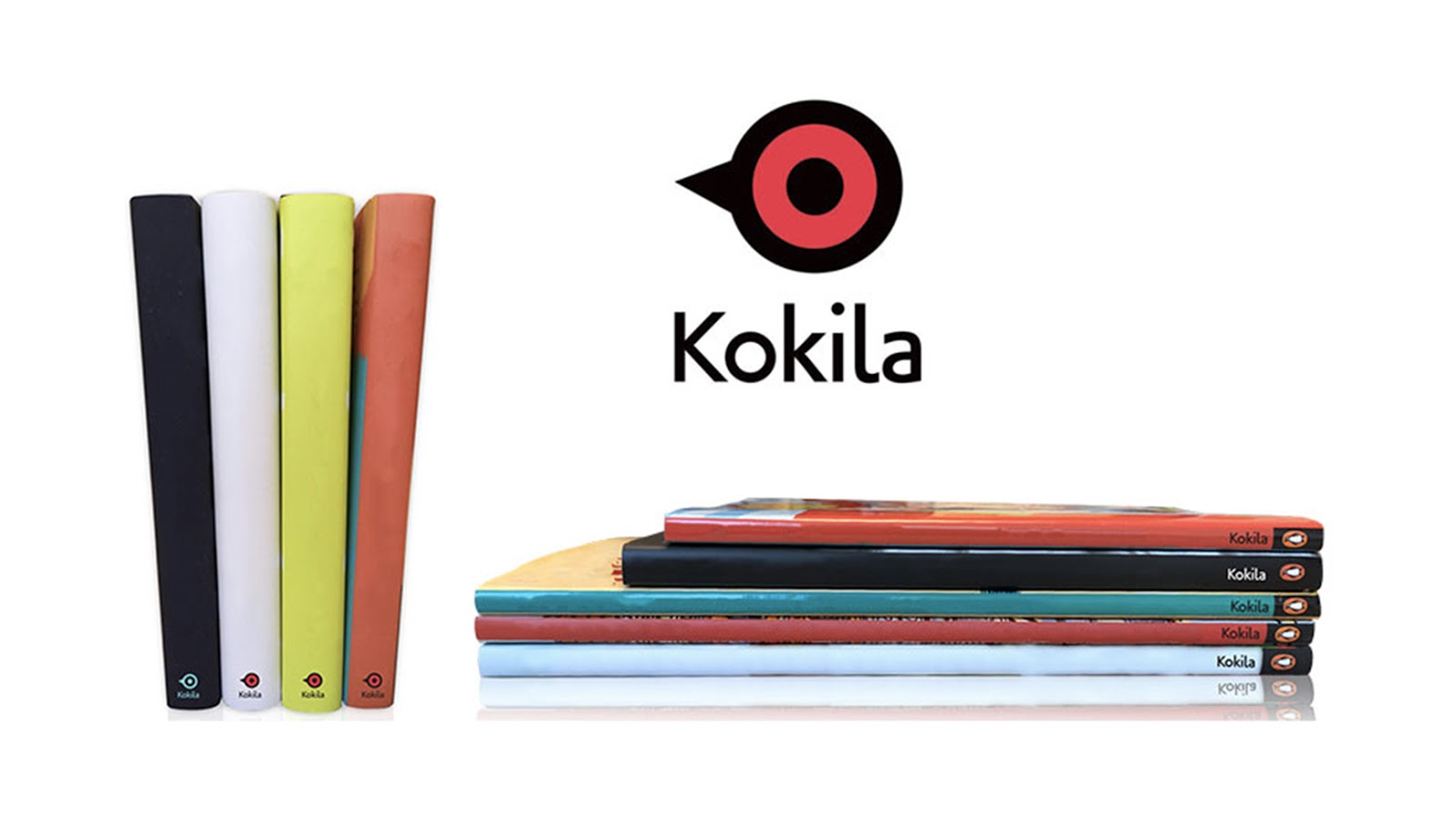
Kokila's brand identity has one of the prettiest logos that I've seen this year. When I first look at it, I immediately understand the idea: a bird whose wide-open eye is an invitation to read. I like the simplicity of the circular form, a shape that children immediately relate to. Uncomplicated, with nothing in it but the pupil. An excellent focal point.
Indeed, graphic designer Jasmin Rubero explains in Adobe Create Magazine that the provenance of the word "kokila"—Sanskrit for the koel bird, a large cuckoo—is her source of inspiration. I can already imagine how beautifully this logo will be adapted to media other than book spines and covers.
Memorability and simplicity are two characteristics of a really great logo. Kokila is flying beautifully with both..